
The most common question I get asked by clients is how to bring character and personality into a decorating scheme, and there are as many answers to this as there are colours on a paint chart.
Personal preference is the most important factor when you are making decisions about colour. After all, you are decorating your house, not your neighbours’, and if a particular colour makes you feel happy, that is the effect you will experience when you use it in your home. Each and every one of us responds differently to colour depending on preferences, associations and phobias, but by using colours that you are drawn to, you will create an environment that will make you feel good.
This is all very well, but most of us share our home with others, and what happens when we just don’t agree on a particular shade? Whilst there is always compromise to be made, often in decorating the result can lack commitment to the original idea. I find that rather than simply presenting your husband/wife/teenager/toddler with your preferred shade and trying to convince them that it really is exactly what they want, building a few different schemes around it can be more persuasive.
A simple complementary colour scheme is an easy starting point. Look for colours which sit directly opposite each other on the colour wheel and you will find high contrast pairings of blues and oranges, yellows and purples or reds and greens which will all create strong, energetic spaces. For a more restful variation on this idea, complementary colours can be used in small doses against a palette of neutrals.
The idea of negotiating the colour wheel may feel a little daunting, and if that is the case for you an analogous colour scheme is an easy option. All you have to do is pick a colour you love and use the two colours that sit on either side of it on the spectrum.
A monochromatic colour scheme, is in analogous colour scheme using neutrals, but don’t be tempted to think monochrome has to be pale. Be a little more daring with dark neutrals like charcoals or chocolate browns. For the brave, a vibrant variation on monochrome using one deeply saturated colour such as a verdant green or an inky blue would make a dramatic style statement.
The Rule of Three is a useful interior design trick to have up your sleeve. Using odd numbers will help your room feel balanced and visually interesting and this works for choosing colours as well as it does for arranging objects. Any combination of your chosen colours in proportions of 60-30-10 can work whether you’re using a complementary scheme with a third accent colour added, an analogous or monochromatic palette.
If your colour combatant is still not won over to your way of thinking, rather than using your preferred colour floor to ceiling, you could suggest using it as an appropriately named Disruptor Colour. Having pored over colour charts for hours carefully building a beautiful, considered decorating scheme, throwing in an unexpected contrast may seem like odd advice, but it will bring another element to the room and stop it feeling too co-ordinated. It is a great way to reflect your personality, bringing an element of irreverence and fun to a space. Think about painting the inside of an alcove or cupboard or draw attention to a stylish radiator.
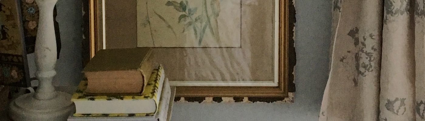
Rugs, lampshades, even books in your Disruptor Colour can all be used to great effect. When used throughout your home, small accents of an unexpected colour will link rooms and spaces by creating a so-called Red Thread. As you move around your home, glimpsing even a small burst of your favourite colour as you look along a hallway or pass an open door is sure to make you feel happy.
