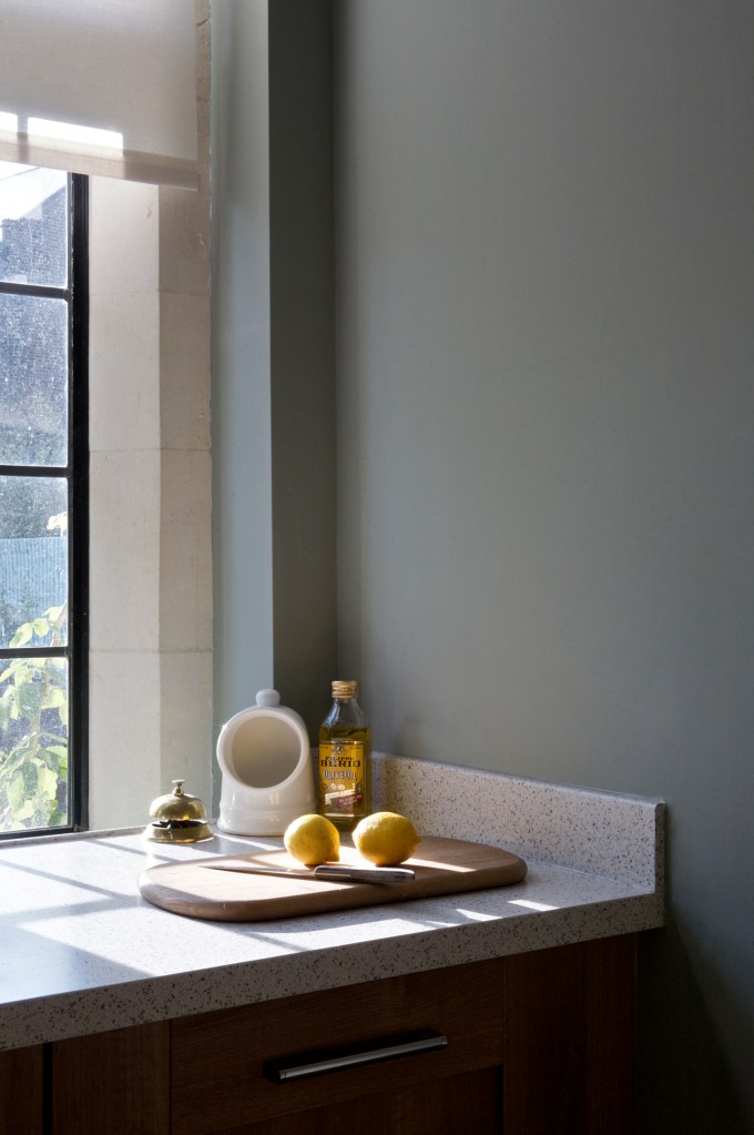
Colour has a profound impact on our everyday lives. It connects directly to our emotions and is fundamental to our psychological wellbeing, influencing all of us on a deeply subconscious level. Picture a world without colour; views, sunsets, flowers and food all in shades of grey. Imagine not being able to express yourself through the colours you choose to wear or decorate your home with. Colour can nurture us, making us feel better about ourselves and better about the world around us.
Every colour has both good and bad aspects, and everybody will react differently to each one depending on the way it is used and the underlying tone. Having said that, true grey (being a combination of only black and white) has no real positive effect on us, only negative, so it may seem odd then that the use of greys in decorating has been so popular recently. Comforting and unchallenging, grey allows us to retreat from emotional noise in the world around us, enabling relaxation. But too much grey without the beneficial influence of other colours, can be tiring and emotionally draining, making it difficult to find motivation. Think about how you feel on a dull, grey day.
The three psychological primaries, red, yellow & blue have the most distinct effect on us. All other colours are a blend of these three colours, so will demonstrate similar traits to a greater or lesser degree.
As the first of the primaries, red has a physical effect on us. Energising and suggesting warmth and excitement, it has great visual impact as it forces our eyes to adjust as we look at it. Use too much or the wrong tone though, and it can feel stressful, making it hard to relax and unwind.
Yellow is directly linked to our ego and nervous system, influencing us on an emotional level. Think of the effect a sunny day has on every one of us; yellow can lift our spirits. Positive and optimistic, it can really boost our self-confidence. Conversely, it can be emotionally draining, provoking feelings of anxiety and irritation.
Often said to be the world’s favourite colour, blue connects to us on an intellectual plane. Darker, saturated blues are mentally stimulating, encouraging clarity of thought, whilst lighter tones are relaxing, invoking feelings of calm and serenity. However, like all other colours, it too has negative attributes and it can come across as cold and aloof.
By analysing global trends in fashion, politics and forecasts, Dulux have a dedicated team of specialists who predict what people will want in the year to come. With so much influencing interiors recently, from the rise of the popularity of house plants, a desire to connect with nature and increased eco awareness and sustainability, it’s not surprising that a soft, delicate green, not unlike Farrow & Ball’s Cromarty, was recently named 2020’s Colour of the Year.
Positioned right in the middle of colour spectrum, green is balanced and restful, needing no adjustment to the eye to be able to see it. In fact, green is used in operating theatres because it rests the surgeons’ eyes when they have been over stimulated after concentrating on so much red. As with all other colours though, green has both positive and negative connotations. It connects with nature, feels refreshing and can inspire harmony, but strike the wrong tone and it can represent decay and even make some people feel unwell.
Colour psychology is a fascinating subject, but even a basic understanding of the subtle differences in the tonal properties of a colour will allow you to use them in beneficial ways, whichever colours you are thinking about using in your home.
