
Held within the collection of the Natural History Museum’s library is a rare and comprehensive colour guide which hovers somewhere between art and science. First published in 1814, a small book called Werner’s Nomenclature of Colours presented a whole new vocabulary for describing the natural world. In the pre-photographic age visual details had to be captured using the written word and scientists could not afford any ambiguity in their descriptions. Invaluable to both naturalists and anthropologists for over two hundred years, Werner’s Nomenclature was an indispensable tool during Darwin’s voyage on the Beagle.
What the book is remarkable for is its lovely descriptions of where each tone can be found in nature. Illustrated only by a small swatch, each handwritten entry is accompanied by an evocative name, such as “Arterial Blood Red” and “Velvet Black”, an identifying number and a precise reference to an animal, a mineral and a vegetable. Precise and poetic, Werner’s original descriptions of colours are very beautiful.
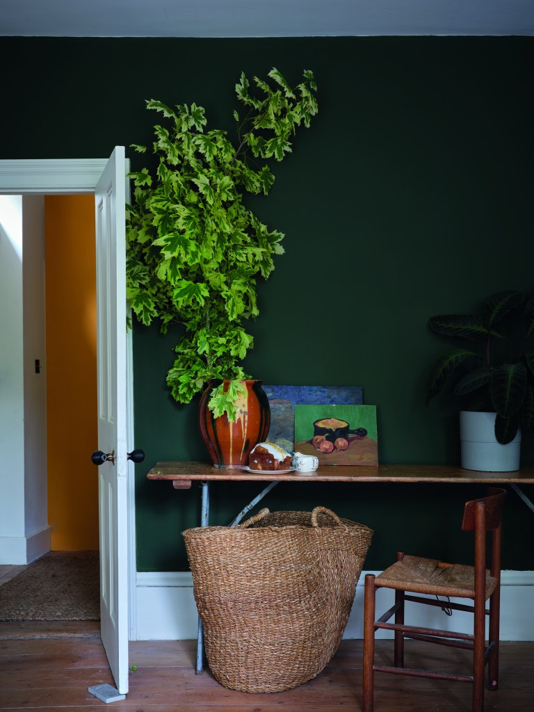
In an exciting collaboration with the Natural History Museum, and drawing inspiration from Werner’s Nomenclature of Colour, Farrow & Ball has created a brand new palette of 16 colours. Colour by Nature is an extension to the 132 colours on the current Farrow & Ball colour card and includes vibrant and jewel like oranges and reds, on trend natural and opulent greens and blues and a range of soft neutrals. Even though some of the brighter, jewel bright shades are not normally associated with F&B, this exciting new palette really demonstrates the variety of genuine and authentic colours found in nature. And as always with F&B, there is a perfect complimentary neutral for each colour, and beautiful colour schemes can be created in combination with the wider range of existing shades on the standard colour card.
For a scheme which has its roots firmly in the past but is incredibly fashionable try Duck Green, Orange Coloured White and Deep Reddish Brown. These earthy colours would be perfect to create a welcoming hall with Duck Green on the walls, Orange Coloured White on the ceiling and Deep Reddish Brown on the woodwork to create a below stairs feel so often seen in the cottages of Spitalfields.
Soft Skimmed Milk walls are the perfect backdrop in any living room, but the addition of Dutch Orange and Verdi Green on doors or window reveals will transform it into a really dynamic space perfect for young families.
Create a lively combination with Emerald Green, Ultra Marine Blue and Lake Red. Ultra Marine Blue walls will never overpower and are a great foil for the two brighter colours which can be used on furniture or even just on a stripe around the room or over the ceiling.
The fabulously glamorous combination of Scotch Blue, Crimson Red and Sap Green will create a rich atmosphere in any room but would particularly suit a dining room. Indulgent Scotch Blue walls and woodwork could be teamed with an equally alluring Crimson Red ceiling, while Sap Green would be the perfect addition on furniture.
Perfect for a light filled modern kitchen, Snow White on both walls and ceiling will create a bright room which can be tempered with Ash Grey units and an Imperial Purple island to ground the room and add an extra dimension to make you smile.
The combination of Broccoli Brown, Sap Green, Duck Green takes its inspiration straight from nature and would be well suited to any garden room or on garden furniture. The three earthy colours can be combined in any way for the ‘mismatched’ look which creates an ultimately relaxed atmosphere.
If you’re feeling inspired to fill your home with beautiful colours of nature, pop into Bridport Timber for a chat, browse the new colours in large format swatches and pick up your new Colour by Nature colour card. Werner’s charming and fascinating little book is still in print and available from all good booksellers, giving us a polychromatic peek into history.
